What Is An INFOGRAPHIC? - FoodARC
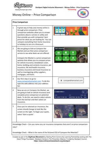
What is anINFOGRAPHIC?Infographics are visual representations ofinformation, data, or knowledge. Infographics canbe used to present complex concepts quickly andclearly to the general population.
Using Infographics as aCommunication ToolThey: Are an easy way to present and understandcomplicated concepts Dynamically combine words and pictures inways that are visually appealing Are able to stand alone Help to reveal and communicate newinformation Are universally understood
A GRAPHIC VISUAL REPRESENTATION OFINFORMATIONDATAKNOWLEDGEIntended to present complexinformation quickly and clearly.
Simply put, aninfographic is
We realized along time agothat IMAGES arean effective wayto communicate.We have used imagery tocommunicate for centuries.
Infographicsfirst appeared innewspapers, butare now muchmore commonand widely used.
Why doinfographicswork?We are swimming in a world of data and informationwherever we go - be it marketing, social media, or healthrecommendations, etc.It’s hard enough trying to process this information, letalone competing to have your data seen in this vastocean.We need ways to effectively communicate vast amountsof information. Infographics are an excellent way to helpwith this.
We understandpictures easierthan words.Infographics areeasy to share onsocial media.
Visuals can alsoovercome culturaland languagebarriers.
Follow this link to view this s/
Creating Your Own Infographics1. Decide what information, data, &/orknowledge you want to share2. Research infographics related to yourtopic & note the design elements used3. Get your own ideas on paper & beginbrainstorming concepts4. Start designing!
Remember your first idea is just astarting point
The Evolution of an InfographicFor example: Halifax Food CountsFirst draftSecond draftStarting points
Third draftFinal
Test.Iterate.Evolve.Change.
Let’s beginwww.piktochart.comThere are many web-based programs that you can use to create infographics. You can usePowerPoint to create an infographic; however, many other programs are simple to useand offer free versions. Piktochart and Visual.ly are both quite user friendly and areavailable in free or pro (paid) versions.
Go to www.piktochart.com to login or sign up.A basic version is available for free or there is a pro version available for a fee.Nonprofits can apply for a license at a reduced rate.
Select the format and theme of how youwould like to present your information.There are many many moreto choose from
Your infographic could look like This, etc.This or This or The possibilities are endless!
Choose a theme to start creating your infographic.Many themes provide you with a template to enter and organize your information.
Tips for Creating Effective Visuals1. Use images more often than words to portray yourinformation.For example, theimages surroundingthe central blue circlerepresent the items ofinterest that werelooked at through theACT for CFS foodsecurity researchreleased in November2014.
2. Alternating Font SizesThere are times when we have a staggering amount of information thatwe can’t present with an image-heavy infographic. These times call forstyles of design that focus more on the fonts and how they can give yourinfographic a professional look without the clutter of too many images.Use alternating font sizes to accentuate the data that you want to be seen.
3. Limit to 4 ColoursWhen creating an infographic,you should start by determiningwhat color scheme you wouldlike to use. A four color setupgives you plenty of creativefreedom to work with. Morethan that can look a bit chaotic.For example, this infographicuses 2 shades of blue, a green,and a pink to create contrastbetween areas.
4. Use icons to demonstrate the data that youare referring to.For example, 1 of 4 highlightedpotted plants demonstrate the25% of public schools in theHalifax Municipality that havea school garden.Or 3 of 4 highlighted schoolhouses represent the 74% ofjunior and senior public highschools that offer a food skilldevelopment program.
1 of the 5 highlighted housesrepresents that almost 20% ofhousehold in Halifax are foodinsecure. The apple in the shadedhouseholds also represents that the4 of 5 households that are shadedare food secure.The 2 of 5 people that arehighlighted represent Halifaxresidents over the age of 12 thatreported meeting their daily fruitand vegetable requirements.
5. Use an related object to your information to representdata as a graph.For example, the apple is used to offer graphic representation of theinstitutions and organizations across Halifax Municipality as havingpolicies with community food security components.
Be sure to have fun andbe creative!
PowerPoint to create an infographic; however, many other programs are simple to use and offer free versions. Piktochart and Visual.ly are both quite user friendly and are available in free or pro (paid) versions. Go to
Infographic Strategy Brief: Write a one page max brief discussing the overall purpose and goals of the infographic. Make sure to provide the following information: goal of the infographic, SMART objectives for the infographic, audience targeted (ex. Employees, customers, social media bloggers, etc.), and stra
Infographic Infographic Infographic Infographic Slide Deck Slide Deck Slide Deck Slide Deck . » X number of vertical-specific third party reports posted per month » Report acquisition role assignments: . » Email timeline: » Email 1: » Email 2: » Email 3: Marketo email example to
AMiddle"School"Survival"Guide" "!!!!! How to Make an Infographic: AN INFOGRAPHIC IS A graphic, visual representation of information.They present information clearly and concisely.
the timeline, and this organizing principle guides the reader through the infographic. As the rhetorical purpose of the infographic is to point out specific technological advancements in place and time, the timeline is an effective format to present inf
According to the food security continuum redesign strategies are the most effective means of building food security because they recognize and focus on policy change to affect the underlying social, political and economic structures that perpetuate food insecurity (Houghton, 1998; Kalina, 2001; TFPC, 1994).
marketingmag.com.au/pro 05 Foreword Roberto Verganti 06 Special guest introduction Design Management Institute 07 Feature Why we need design thinking 12 Infographic Visualising design thinking: the process 13 Infographic Visualising design thinking: Deloitte’s model 14 The debate Topic: ‘Design’s role in business is unquantifiable’
says “Infographic resumes can be highly effective. Pull out five things from the job description that match your talents and make an infographic. Depending on the industry, this can be very impressive for a student to submit to a hiring manager. They will pr
An Introduction to Description Logic IV Relations to rst order logic Marco Cerami Palack y University in Olomouc Department of Computer Science Olomouc, Czech Republic Olomouc, November 6th 2014 Marco Cerami (UP) Description Logic IV 6.11.2014 1 / 25. Preliminaries Preliminaries: First order logic Marco Cerami (UP) Description Logic IV 6.11.2014 2 / 25. Preliminaries Syntax Syntax: signature .


