Responsive Web Design - Webflow
Responsive Web Design An Overview
What is Responsive Web design Responsive Web Design (RWD) was coined by Ethan Marcotte in 2010 in his book, Responsive Web Design.
What is Responsive Web design RWD explains how to design content for the web using HTML, CSS and potentially .js that is minimal in code payload, scales across mobile, tablet and desktop formats, using a single code base, and renders. IN THE BROWSER
Native apps vs rwd Mobile saturation is overtaking the desktop Morgan Stanley Research, 2010
Native apps vs rwd Developing native apps for multiple OS platforms is a design development intensive process, that requires specialized teams who compile applications for each OS. EXPENSIVE
Rwd components There are 3 main components to successful RWD projects, that work together to enable creative content to render, scale and reflow on different devices. Fluid Grids Flexible Media Media Queries @
Formula magic Responsive design relies on div s and images being resized and repositioned. Resizing is achieved by using %s as widths and element sizes (like images) rather than pixels. The formula which governs this is: Target width / context width *100 % width
Fluid grid The structural element based on the formula I just mentioned, is the fluid grid. This grid allows designers to keep using a visual structure while allowing developers to preserve the design intention as you scale down to small screens. Rather than create an actual grid, it is a method to align elements when the overall design scales down.
Fluid grid The basic grid for our design: Lorem Ipsum 60px columns
Fluid grid The basic layout for our design: 960px context width Lorem Ipsum 600px target width Target width / context width *100 % width
Fluid grid The basic math for our design: Lorem Ipsum 600px / 940px *100 63.82978% 600 / 940 *100 63.82978%
Fluid grid The basic math for our design: Lorem Ipsum .some-div {width: 63.82978%;} 600 / 940 *100 6.382978%
fluid media - images Current best practice: img { max-width: 100%; } Requires full sized images for each media query
Fluid media - images For images Lorem Ipsum img {max-width: 100%;}
fluid media - fonts Base browser configuration: 100% 16pt 1em This sets the “context” and will ensure manual browser zooming
Fluid media - fonts For fonts Lorem Ipsum24pt target h1 24pt target / 16pt base font context 1.5em
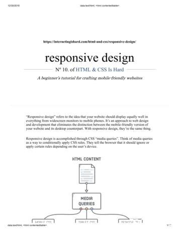
Media queries Media Queries let you define “break points” within which you specify CSS properties for browsers in specific widths. Phones: @media only screen and (min-width: 480px) { . } Tablets: @media only screen and (min-width: 960px) { . } Desktops: @media only screen and (min-width: 1280px) { . }
Media queries @media screen and (min-width: 767px) {header img .logo {align: left;}} @media screen and (min-width: 320px) {header img .logo {align: middle;}}
examples Rocket Lawyer
examples The Expressive Web
examples Anderson Wise
tools Adobe Reflow
tools Webflow
tools Bootstrap
What is Responsive Web design RWD explains how to design content for the web using HTML, CSS and potentially .js that is minimal in code payload, scales across mobile, tablet and desktop formats, using a single code base, and renders. IN THE BROWSER. Mobile saturation is overtaking the desktop
alization, visualization authoring, and responsive web design. Responsive Web Design While responsive visualization is still a nascent area, respon-sive web design has received more attention. Patterns and principles of responsive web design have been studied [15, 16]. HTML5 and CSS3 are popular standards to implement responsive designs [9].
alization, visualization authoring, and responsive web design. Responsive Web Design While responsive visualization is still a nascent area, respon-sive web design has received more attention. Patterns and principles of responsive web design have been studied [15, 16]. HTML5 and CSS3 are popular standards to implement responsive designs [9].
that’s what responsive web design is: a possible solution, a way to more fully design for the web’s inherent flexibility. If we’re willing to research the needs of our users, and apply those ingredients carefully, then responsive web design is a powerful approach indeed. Ethan Marcotte, “Responsive Web Design”
Responsive Web Design Ethan Marcottecoined the term responsive web design and . Responsive Web Design (RWD) is a Web design approach aimed at crafting sites to provide an optimal viewing experience, easy reading and navigation with a minimum of resizing, panning, and scrolling, across a wide range of screen sizes and devices.
1.1. Possible Solutions for Multi-channel Web Design 7 RESPONSIVE WEB DESIGN 7 2.1. Core Ingredients of RWD 8 2.2. Tools for RWD 9 DESIGNING A RESPONSIVE WEB SITE 9 3.1. The Business Case 10 3.2. The Design Approach 10 CREATING A RESPONSIVE SHAREPOINT SITE 14 4.1. Building a SharePoint Master Page 15 4.2. Making the Master Page Responsive 15 4.2.1.
Enterprises 2 i/l nail jigs tibia 4 2 36,000 720 M/s Mian Enterprises 3 recon nail jigs 4 2 36,000 720 M/s Surgiquips Non Responsive Non Responsive . kocher forceps large M/s Mian Enterprises 549.00 Responsive A.M Ortho Local Responsive M/s M.J Marketing & Services (SMC-Pvt) Ltd Non Responsive Non Responsive 26 allis forceps large
Keywords Responsive design, pattern, principles, mobile first, relative units . Contents 1 Introduction 1 2 Responsive Web Design 2 3 Principles and Patterns 8 3.1 Mobile First 8 3.2 Relative Unit and Media Query 13 . Although Responsive Web Design is widely known as a feasible solution, the process to
actually pretty easy to implement a responsive layout. (Responsive Images, on the other hand, are an entirely different story). setup Create a new project called responsive-design and a new file called responsive.html. It's the emptiest web page that we've seen in awhile, but it'll help us demonstrate something


