Responsive Web Design - Home - Web Publishing
Web Publishers GroupTuesday 13 March 2012
Responsive Web DesignMobilising the InternetScott O’BrienTechnical Web CoordinatorANU Marketing Office
Responsive web design Designing a website in a manner that helps thelayout to change according to the user’s screenresolution – regardless of the device The auto simplification of advanced multi-column layoutson wide screens to a minimum of one or two columnlayouts on narrow screens3
Planning for the future We’re now faced with a browser landscape that’s becomeincreasingly untethered from the desktop, with devicesbecoming smaller and larger simultaneously. Small-screendevices are estimated to become the dominant form of webaccess in a matter of echresearch/mobile internet report122009.html4
The future is now Mobile phones will overtake PCs as the most common Webaccess devices worldwide by 2013, according to a newforecast by research firm Gartner. That's an even moreaggressive outlook than Morgan Stanley's projection thatthe mobile Web will outstrip the desktop Web in five years.Mark Walsh, “Gartner: Mobile To Outpace Desktop Web By le/1205905
Smartphones overtake PCs 2011 Total annual global shipments of smart phonesexceeded those of client PCs (including pads) for thefirst time in 2011 158.5 million smartphones in Q4 2011 120.2 million PCs in Q4 2011 2012 ?488 million smartphones415 million ertake-client-pcs-20116
Smartphones 13.2% of the world’s 6.1 billion cellphones aresmartphones. 30% in the Germany, UK and UnitedStates. Over 50% in Sweden and Finland 55% of Twitter’s traffic comes from mobile devices 33% of Facebook updates come from mobile devicesLuke Wroblewski, “Data Monday: More on Mobile”http://lukew.com/ff/entry.asp?14507
PayPal Payments via mobile: 2009 2010 141M 750M 2011 pals-mobile-payments-4b-2011/8
Old ideas are new again Most sites on the web are not built with specific mobile usecases in mind. However, millions of people access thesesites every day through mobile devices. They access a“normal” (whatever that means) website through their“mobile” device. It seems like the Mobile Web allows us torevisit all of the talk of inclusion, progressive enhancement,and accessibility from years ago.Stephen Hay, “There is no Mobile -is-no-mobile-web/9
Design for adaptability The continued introduction and adoption of more and moremobile devices is what will make 2012 the year of theresponsive web site. Web designers and developers willmove to the use of fluid layouts instead fixed width, andmedia queries will find their way into many morestylesheets – allowing more sites to easily be viewedacross multiple screens sizes and devices.Jake Rocheleau, “Web Design Trends in trends-in-201210
Design for context Since mobile devices are (just about) always with theirowners, time and location play a big role in defining theircontext of use. And because mobile devices have theability to talk, text, IM, and email people (plus an addressbook!), social rounds out the triumvirate of mobile context.When you design for mobile you are designing somethingthat can be used anywhere, anytime, and be instantlyshared/discussed with other people.Luke Wroblewski, “When & Where Are People Using Mobile 1
Change is inevitable We can quarantine the mobile experience on separatesubdomains, spaces distinct and separate from “the noniPhone website.” But what’s next? An iPad website? AnN90 website? Can we really continue to commit tosupporting each new user agent with its own bespokeexperience?Ethan Marcotte, “Responsive Web sive-web-design/12
Embrace individuality The control which designers know in the print medium,and often desire in the web medium, is simply a function ofthe limitation of the printed page. We should embrace thefact that the web doesn’t have the same constraints, anddesign for this flexibility. But first, we must “accept the ebband flow of things.”John Allsopp, “A Dao of Web Design”http://www.alistapart.com/articles/dao/13
Throw off the yoke When a new medium borrows from an existing one, someof what it borrows makes sense, but much of the borrowingis thoughtless, “ritual”, and often constrains the newmedium.John Allsopp, “A Dao of Web Design”http://www.alistapart.com/articles/dao/14
Design responsively Web design is about asking the right questions. And really,that’s what responsive web design is: a possible solution, away to more fully design for the web’s inherent flexibility. Ifwe’re willing to research the needs of our users, and applythose ingredients carefully, then responsive web design isa powerful approach indeed.Ethan Marcotte, “Responsive Web sive-web-design/15
Responsive web design (reprise) Designing a website in a manner that helps thelayout to change according to theuser’s screen resolution – regardlessof the device The auto simplification of advanced multi-column layoutson wide screens to a minimum of one or two columnlayouts on narrow screens16
50 Examples and Best xamples/17
http://seesparkbox.com/18
http://earthhour.fr/19
http://www.bostonglobe.com/20
http://www.stpaulsschool.org.uk/21
http://asuonline.asu.edu/22
How does it work? A flexible grid Flexible images and media CSS3 media queries23
Flexible grid A flexible grid-based layout is one of the cornerstones ofresponsive design. The term “grid” is used rather freely Stop using pixel-based layouts and start usingpercentages or the em for sizing By basing text sizes, widths and margins on percentagesor on the em you can turn a fixed size into a relative size. You’ll need to do a little math to achieve a flexible gridand text size system. But the formula for calculating theem is very simple:24
Flexible grid(cont’d) Remember target context resultLet’s say the normal context for the body font size is 16pixels. If the designer specifies that the H1 should be 24pixels, you can calculate the following:(target) 24 (context) 16 1.5This results in the following CSS style:h1{ font-size: 1.5em; }25
Flexible images Adapt your images or other media to load differentlydepending on the device, either by scaling or by usingthe CSS overflow property You can set the media element’s max-width to 100percent, and the browser will make the image shrink andexpand depending on its containerimg, object { max-width: 100%; } applying overflow:hidden allows you to crop imagesdynamically26
CSS3 media queries You can use media queries to scope styles to specificcapabilities, applying different styles based on thecapabilities that match your query You can even combine queries that test for severalfeatures by using semantic operators such as AND andNOT) Features include width, height, max-width, max-height,device-height, orientation, aspect-ratio, resolution andmore There are three ways to implement media queries27
CSS3 media queries(cont’d) 1. Use the @import rule to import styles from other stylesheets:@import url(style600min.css) screen and(min-width: 600px);28
CSS3 media queries(cont’d) 2. Put media queries directly in the style sheet:#nav { float: right; }#nav ul { list-style: none; }@media screen and (min-width: 400px) and (orientation:portrait){#nav li { float: right; margin: 0 0 0 .5em;border:1px solid #000000; }}@media screen and (min-width: 800px) {#nav { width: 200px; }#nav li { float: left; margin: 0 0 0 .5em;border: none; }}29
CSS3 media queries(cont’d) 3. Include a query in a linked style sheet’s mediaattribute: link rel "stylesheet" type "text/css" media "screen and(max-device-width: 800px)" href "style800.css" / Because of the (cascading) nature of CSS, default stylesare defined at the top with the media query matchingrules and styles below. Styles defined at the top will becascaded to the matching styles in the rule, or evencompletely overwritten.30
Old and busted Legacy browser support? Javascript solutions to replace media queries and torefine scaled images STOP holding back the future Those that cry, “it can’t be done!” should makeway for those of us who are busy doing it.31
Project StrategyDiscoveryDesignEstablish a focus group1. Project schedule2. Requirements document3. Communications strategyDevelopmentDeployment32
What does all this mean? Responsive Web Design HTML 5 CSS 3 Major changes – all behind the scenesSome existing styles will changeSome new styles will be introducedTemplates will work the same as now (mostly)Existing sites will essentially stay the sameOpportunities for new home page layouts33
Status quo In the past we’ve looked at what other universities aredoing on the web (ie Oxford, Stanford, Yale, Harvard)and then adopted the best ideas The Web Transformation Project has been preparing theuniversity’s web presence for a major jump in technologyand design We can become a leader rather than a follower34
Further reading A Dao of Web Design (John Allsopp) http://www.alistapart.com/articles/dao/Responsive Web Design (Ethan Marcotte) design/Responsive Web Design id nmtfiP3zMHvThere Is No Mobile Web (Jeremy Keith) http://goo.gl/pFCX7For a Future-Friendly Web http://goo.gl/BGcHnStructured Content First (Stephen Hay) http://goo.gl/HI6REPragmatic responsive design http://goo.gl/d2daWResponsive by default http://goo.gl/IiL35A Richer Canvas http://goo.gl/lWDxCResponsive Advertising http://goo.gl/MGhGoYou Say Responsive, I Say Adaptive http://goo.gl/tA1zJA Responsive Design Approach for Complex, Multicolumn Data Tables http://goo.gl/n8S1qResponsive Data Table Roundup http://goo.gl/3GVoxDebugging CSS Media Queries http://goo.gl/5eawIConvert a Menu to a Dropdown for Small Screens http://goo.gl/KDE9tMobile Content: If in Doubt, Leave It Out http://www.useit.com/alertbox/mobile-writing.html The ultimate responsive web design -ultimate-responsive-web-design-roundup/35
Questions ? Remember: Web design and development is an evolvingand sometimes experiential process We’re implementing these changes based ondiscoveries from continuous improvement reviews,suggestions from other web developers and theconsidered opinion of industry best practice email webstyle@anu.edu.au36
What are you doing? Lots of fantastic and interesting stuff goeson in the web space on campus, but doesanyone know about it?Web Publishers Group 30/11/1137
Open Q&A Got a burning web related question? Ask away and see what you can find out No question is ever too stupid, but notasking the question is!Web Publishers Group 30/11/1138
applause Thanks for coming! /applause Web Publishers Group 20/04/1139
that’s what responsive web design is: a possible solution, a way to more fully design for the web’s inherent flexibility. If we’re willing to research the needs of our users, and apply those ingredients carefully, then responsive web design is a powerful approach indeed. Ethan Marcotte, “Responsive Web Design”
alization, visualization authoring, and responsive web design. Responsive Web Design While responsive visualization is still a nascent area, respon-sive web design has received more attention. Patterns and principles of responsive web design have been studied [15, 16]. HTML5 and CSS3 are popular standards to implement responsive designs [9].
alization, visualization authoring, and responsive web design. Responsive Web Design While responsive visualization is still a nascent area, respon-sive web design has received more attention. Patterns and principles of responsive web design have been studied [15, 16]. HTML5 and CSS3 are popular standards to implement responsive designs [9].
1.1. Possible Solutions for Multi-channel Web Design 7 RESPONSIVE WEB DESIGN 7 2.1. Core Ingredients of RWD 8 2.2. Tools for RWD 9 DESIGNING A RESPONSIVE WEB SITE 9 3.1. The Business Case 10 3.2. The Design Approach 10 CREATING A RESPONSIVE SHAREPOINT SITE 14 4.1. Building a SharePoint Master Page 15 4.2. Making the Master Page Responsive 15 4.2.1.
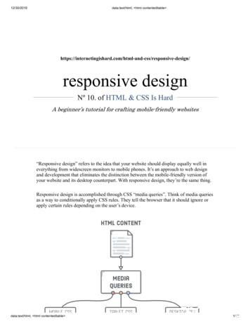
Responsive Web Design Ethan Marcottecoined the term responsive web design and . Responsive Web Design (RWD) is a Web design approach aimed at crafting sites to provide an optimal viewing experience, easy reading and navigation with a minimum of resizing, panning, and scrolling, across a wide range of screen sizes and devices.
Enterprises 2 i/l nail jigs tibia 4 2 36,000 720 M/s Mian Enterprises 3 recon nail jigs 4 2 36,000 720 M/s Surgiquips Non Responsive Non Responsive . kocher forceps large M/s Mian Enterprises 549.00 Responsive A.M Ortho Local Responsive M/s M.J Marketing & Services (SMC-Pvt) Ltd Non Responsive Non Responsive 26 allis forceps large
actually pretty easy to implement a responsive layout. (Responsive Images, on the other hand, are an entirely different story). setup Create a new project called responsive-design and a new file called responsive.html. It's the emptiest web page that we've seen in awhile, but it'll help us demonstrate something
Keywords Responsive design, pattern, principles, mobile first, relative units . Contents 1 Introduction 1 2 Responsive Web Design 2 3 Principles and Patterns 8 3.1 Mobile First 8 3.2 Relative Unit and Media Query 13 . Although Responsive Web Design is widely known as a feasible solution, the process to
ANIMAL NUTRITION Tele-webconference, 27 November, 10 and 11 December 2020 (Agreed on 17 December 2020) Participants Working Group Members:1 Vasileios Bampidis (Chair), Noël Dierick, Jürgen Gropp, Maryline Kouba, Marta López-Alonso, Secundino López Puente, Giovanna Martelli, Alena Pechová, Mariana Petkova and Guido Rychen Hearing Experts: Not Applicable European Commission and/or Member .


