Creating Charts In Excel
CREATING CHARTS IN EXCELCREATING THE PRESENTATION CHARTS IN MICROSOFT EXCELCREATING CHARTS IN EXCEL
CREATING CHARTS IN EXCELCreating charts in excel is fairly easy. Excel can help you choose the best chart to represent your data. With some practice, you canlearn to modify charts and display your data in an eye-catching way. To use this tutorial, you will need data to work with.Recommend entering your organization’s audited financial statement data into the document. Otherwise, sample data available inTable 1: Example Data and Table 2: Table Formulas can be found at the end of this booklet.CREATING A COLUMN CHARTBoth the Bar and the Column charts display data using rectangular bars where the length of the bar is proportional to the data value.Both are used to compare two or more values. However, their difference lies in their orientation. A Bar chart is oriented horizontallywhereas the Column chart is oriented vertically.Let’s make a simple Column Chart.CHARTING REVENUES:CHART THE TOTAL REVENUE FOR 2012-2017 IN A COLUMN CHART.1.Select the data to be displayed inthe table.2.In the navigation pane, selectINSERT Recommended Charts from the Charts menu.Recommended charts makes it simple to select a chart thatbests represents the data selected.Make sure that you select a chart that seems like it will makethe most sense. This is just one way in excel to make a chart.1 P a g eRevised: 10/25/19
3.Now you have a chart of Total Revenuesfor the years 2012-2017.Excel has many options for formatting tomake your information moreunderstandable or better displayed.Let’s spruce this chart up by making it 3Dand adding data labels.4.Select the chart you just created.Navigate to Design Type Change Chart Type.Under the “Change Chart Type” window, select the 3-D ClusteredColumn option and click “OK”.You will now have a 3D Chart. Tocustomize it even more, Excel givesoptions for formatting. Select theformat you like.2 P a g eRevised: 10/25/19
CREATING A STACKED COLUMN CHARTA stacked column chart, also known as a stacked column graph, is a graph that is used to break down and compare parts of a whole.Each column in the chart represents a whole, and segments in the column represent different parts or categories of that whole.CHARTING REVENUE SOURCES AS PART OF TOTAL ANNUAL REVENUE:CHART THE DIFFERENT TYPES OF REVENUE FROM 2012-2017 AS A STACKED COLUMN CHART.1.Select the data you wantto chart.2.Select the “Stacked Column” chart type from the INSERT Charts Recommended Charts.3.You know have a stacked column chart that shows thedifferent categories of revenue for each year.4.Format the chart however you think the data is bestrepresented.You can edit the chart tiles, colors, borders, axispositions, etc. by right clicking on the chart and using the“Format Chart” options.3 P a g eRevised: 10/25/19
CREATING A COMBINATION CHARTA combination chart is a chart that combines two or more chart types in a single chart. The combination chart displays the data singa number of bars and/or lines, each of which represent a particular category.CHARTING MONTHLY OPERATIONAL COST AND FUND BALANCESCREATE A CHART THE THAT SHOWS THE ANNUAL DISTRICT OPERATIONAL COST AS A COLUMN CHART AND THENUMBER OF MONTHS OF SUPPORTING FUND BALANCE AS A LINE CHART FOR 2012-2017.1.Select the data you want to chart.2.From INSERT Recommended Charts,select All Charts Combo.Chose the chart type you want to display foreach data series. In this example, chooseClustered Column for “Monthly Cost ” andLine for “# of months Fund Balance ”.Select Secondary Axis for the line chart type.Click OK.Now you can see the ’s on the Left Axis andthe #’s on the right.4 P a g eRevised: 10/25/19
EDITING CHARTSExcel is a great tool. There are many options available to format your charts so that they look exactly how you want them to.Remember these mottos: 1.) if it seems like something you should be able to do, you probably can, and 2.) If you can’t figure itout GOOGLE IT. Google usually spits out the answer of how to change something.For the sake of these examples, I’m going to show you the most basic ways to edit the look of your charts.EDITING TITLES, AXIS AND LEGENDS.EDIT THE COMBO CHART YOU JUST CREATED TO ADD A CHART TITLE, ADJUST THE LEGEND AND MAKE THE TEXTLARGER1.Select the combo chart you created in the example above. From the Ribbon, navigate to CHART TOOLS DESIGN.2.Select the dropdown menu arrow next to show the Quick Layout optionsavailable. This will display all of the ways that you can quickly adjust the chartelements such as the legend, title, and axis.For this example, let’s choose the layout which displays the information in atabular legend.Now the data is displayed as a graph, but the key points are also summarizedin a table below the graph. Best of both worlds.5 P a g eRevised: 10/25/19
3.Now let’s format the chart and axis titles. Select the “Chart Title” text box. Click inside the text box again to edit the textand type in a title name.4.Once completed, right-click the selected text box and select Format ChartTitle.5.A formatting menu will pop-up on the right hand side of the screen. You can now see the many options available to recolor,resize, realign or add borders and shape to your chart title.6.Repeat the process to add a name to the left axis title. Change the formatting of the text using either the Format Chart toolor by making edits from the tools located in the ribbon, similar to any Microsoft Word document. It works from either tool.You can see below, that I have made a number of edits to the original chart to make it more eye-catching for my use in areport.6 P a g eRevised: 10/25/19
GETTING MORE EXAMPLE INFORMATIONFor the 2018 BWSR Academy session (Foreign Language of Financial Statements), a template workbook using real data examples hasbeen created in excel, which you can use to plan your own financial statement analysis and graphical displays.The template also has a Dashboard template included. A dashboard is a visual representation of relevant information that isupdated frequently. It can be a very useful tool to quickly and consistently analyze your data and present it to your district boardsupervisors for decision making.The template is intended to be a guide indeveloping ways to use your own information,and all necessary formulas and tables are labeledand available for you to look at.Additionally, there are many, many tutorialsonline on how to use Excel effectively. Youcan look up any number of issues throughMicrosoft Help, Google, or peruse an endlesslist of YouTube tutorials.If you get stuck, remember “IF IT SEEMS LIKE YOU SHOULDBE ABLE TO DO IT, YOUPROBABLY CAN.”“GOOGLE IT.”7 P a g eRevised: 10/25/19
TABLES AND EXAMPLE DATA8 P a g eRevised: 10/25/19
Table 1: Example DataBALANCE SHEET201220132014201520162017AssetsCash and InvestmentsDue from Other Governments 236,291 365,448 277,421 218,443 630,546 694,405 40,658 14,521 18,812 254,891 87,695 42,898 2,299 1,980 8,399Accounts ReceivableAccrued InterestInventory 274 4,000 4,000 4,000 4,000 3,000 913 281,223 383,969 300,233 479,633 723,221 746,615 763 920 1,215 1,692 2,690 10,546Salaries Payable 5,214 5,279 7,453 9,571 14,672 17,100Deposit on Sales 2,688 1,695 1,035 3,120 19,487 25,948Unearned Revenue 215,196 304,998 192,408 258,110 449,206 417,796Total Liabilities 223,861 312,892 202,111 272,493 486,055 474,767 4,000 4,000 4,000 4,000 3,000 913Total AssetsLiabilitiesAccounts PayableDue to Other Governments 3,377Fund BalanceNonspendable - InventoryAssigned - Compensated Absences 8,262 12,821 10,857 16,105 18,559 19,879Unassigned 45,100 54,256 83,265 187,035 215,607 251,056Total Fund Balance 57,362 71,077 98,122 207,140 237,166 271,848 281,223 383,969 300,233 479,633 723,221 746,615 45,100 54,256 83,265 187,035 215,607 251,056Annual Cost of District Operations 338,394 356,708 329,434 391,713 520,464 620,392Monthly Cost of District Operations 28,200 29,726 27,453 32,643 43,372 51,6991.61.83.05.75.04.9Total Liabilities and Fund BalanceUnrestricted Fund Balance# of Months Fund Balance will Support District Operations
PROFIT AND LOSS rnmentalCounty 189,902 191,628 194,236 208,482Federal 4,445 9,640 19,364 25,960State Grant 255,355 188,447 225,831Total Intergovernmental 449,702 389,715 31,392 28,833Charges for ServicesMisc. - Interest Earnings 195,159 249,877 723,104 1,026,294 1,010,187 439,431 957,546 1,221,453 1,260,064 28,324 36,243 45,956 47,841 877 235 258 292 307 141Misc. - Other 8,708 4,969 5,603 5,116 10,187 6,490Total Miscellaneous 9,585 5,204 5,861 5,408 10,494 6,631 490,679 423,752 473,616 999,197 1,277,903 1,314,536 290,676 315,683 280,757 319,564 434,141 516,286 46,468 41,025 46,765 72,149 81,024 70,996 1,250 0 1,688 0 5,299 33,110 338,394 356,708 329,434 391,713 520,464 620,392 22,409 20,718 22,419 2,849 27,539Total RevenuesExpendituresDistrict OperationsPersonnel ServicesOther Services and ChargesSuppliesCapital Outlay-depr.Total District Operations 224Project ExpendituresDistrictCounty 1,407Federal 2,126 3,010 16,597State 138,679 32,611 91,185 495,456 724,564 615,326Total Project Expenditures 161,088 53,329 117,137 498,466 727,413 659,462 499,482 410,037 446,571 890,179 1,247,877 1,279,854- 8,803 13,715 27,045 109,018 30,026 34,682Total ExpendituresExcess of Revenues Over (Under) Expenditures1 P a g eRevised: 10/25/19
Table 2: Table FormulasList of Formulas Calculated FieldsTotal Assets SUM(Cash and Investments Due from Other Govts Accts Receivable AccruedInt. Inventory)Total Liabilities SUM(Accts Pay. Salaries Pay. Dep on Sales Due to Other Govt UnearnedRevenues)Nonspendable – Inventory (Assets:Inventory)Unassigned SUM(Total Assets – Total Liabilities – Nonspend. Inventory – Assigned Com.Absences.)Total Fund Balance SUM(Nonspendable Inventory – Assigned Comp. Absences. – Unassigned)Total Liabilities and Fund Balance SUM(Total Liabilities Total Fund Balance)Total Intergovernmental SUM(County Federal State Grant)Total Miscellaneous SUM(Misc Interest Earnings Misc. Others)Total Revenues SUM(Total Intergovernmental Charges for Services Total Miscellaneous)Total District Operations SUM(Personnel Services Other Services and Charges Supplies CapitalOutlay-depr.)Total Project Expenditures SUM(District County Federal State)Total Expenditures SUM(Total District Operations Total Project Expenditures)Excess of Revenues Over (Under)Expenditures SUM(Total Revenues – Total Expenditures)Unrestricted Fund Balance SUM(Fund Balance:Unassigned)Annual Cost of District Operations SUM(Total District Operations)Monthly Cost of District Operations SUM(Annual Cost of District Operations / 12)# of Months of Fund Balance SUM(Unrestricted Fund Balance / Monthly Cost of District Operations)
CREATING CHARTS IN EXCEL . Creating charts in excel is fairly easy. Excel can help you choose the best chart to represent your data. With some practice, you can learn to modify charts and display your data in an eye-catching way. To use this tutorial, you will need data to work with.
Excel 5.0 Excel 5.0 1993 Excel 5.0 1993 Excel 7.0 Excel 95 1995 Excel 8.0 Excel 97 1997 Excel 98 1998 Excel 9.0 Excel 2000 1999 Excel 2001 2000 Excel 10.0 Excel XP 2001 Excel v.X 2001 Excel 11.0 Excel 2003 2003 Excel 2004 2004 2.1.2 Worksheet Document Definition: Worksheet Document A worksheet document consists of a single sheet only.
Table: A tool used to group data together in the Excel program. Workbook: Excel program file. Worksheet: Worksheet within the excel file. Excel for Agribusiness: Charts (Video Lesson 2) Charts: The term for graphical representation of data. Charts represent data as a symbolic alternative including bar, line, or pie charts.
3) Auxiliary charts - change charts 4) Constant pressure charts (C.P. Charts) 5) Cross section charts, 6) Vertical time section, 7) Vertical cross section 8) Te-phi-gram 9) Radar echo charts Other charts Coverage of these charts depends upon the area for which the forecast is to
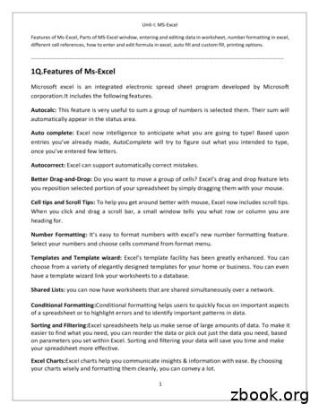
Unit-I: MS-Excel Features of Ms-Excel, Parts of MS-Excel window, entering and editing data in worksheet, number formatting in excel, . Templates and Template wizard: Excels template facility has been greatly enhanced. You can . your spreadsheet more effective. Excel Charts:Excel charts help
Power Map Power Map provides a new perspective for your data by plotting geocoded data onto a three-dimensional view of the earth and optionally showing changes to that data over time. To use Power Map, you import raw data into a Microsoft Excel 2013 workbook, add the data to an Excel data model, and enhance the data in the data model if necessary.File Size: 1MBPage Count: 17Explore furtherGetting an excel list of all Azure Virtual machinesdbaharrison.blogspot.comDownload Azure Devops Board To Excelwww.how-use-excel.comGetting an excel list of all Azure Virtual machines .www.firstcloud.ioGetting an excel list of all Azure Virtual machines .laptrinhx.comRunning Excel On Azurewww.how-use-excel.comRecommended to you based on what's popular Feedback
We present a free add-in for Excel that draws the most common sorts of control charts. It follows the development of the textbook ofMontgomery(2005), so it may be well-suited for instructional purposes. Keywords: statistical process control, SPC, control charts, Excel. 1. The Excel spreadsheet program and control charts 1.1. Introduction
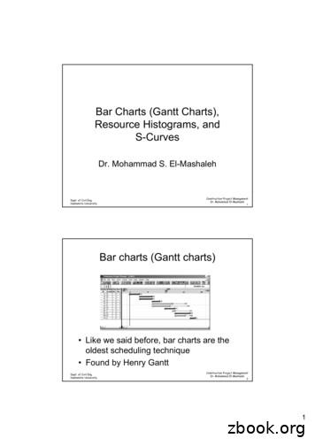
Bar Charts (Gantt Charts), Resource Histograms, and S-Curves Dr. Mohammad S. El-Mashaleh Dept. of Civil Eng. Hashemite University Construction Project Management Dr. Mohammad El-Mashaleh 2 Bar charts (Gantt charts) Like we said before, bar charts are
Introductory Music Lesson Plan s r 1: To make students aware that notes have "names" 2: To develop the ability to identify any "natural" note with reference to a piano keyboard


